Innovista
Services
Stakeholder engagement
Repositioning
Messaging and Tone of Voice
Visual identity & logo design
Website design & UI
Industry
Charity
Christian charities
Education
Careers
Innovista needed a new brand that would work equally well for Christian leaders, charity staff and donors. IE Brand repositioned the organisation and created a hopeful, positive brand that also reflects the grittier, more challenging side to their work.
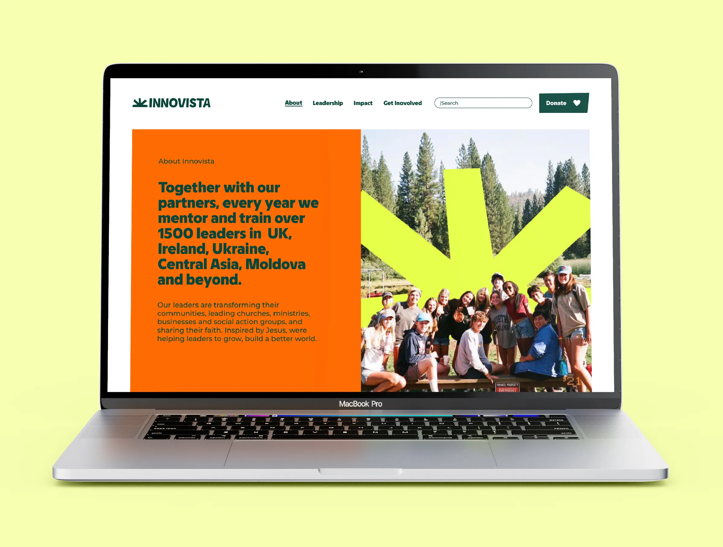
Innovista supports Christian leaders where they’re needed most, equipping leaders to build a better world. Every year, they train and mentor around 1,500 leaders in Britain, Ireland, Moldova, Ukraine, Central Asia and beyond. They help leaders to transform people and communities through churches, ministries and enterprises.
With IE Brand’s help, Innovista can now describe what they do clearly and confidently. They have a visual identity they can be proud of and that shines a light on the amazing work of their leaders.
Image
Video file
Image
Listen
Stakeholder workshops
IE Brand’s consultants immersed themselves in the Innovista brand to understand the organisation’s history, evolution and constraints. We looked at existing research, strategy and marketing, including what had and hadn’t worked for them previously.
We then facilitated a brand positioning workshop with a cross-section of Innovista’s stakeholders. We talked about internal and external perceptions of the brand and explored how to communicate the essence of the charity.
We heard how Innovista’s approach is distinctive. It’s bespoke and highly relational. They experiment at first and then take a long-term, partnership approach. Training is delivered by dedicated local trainers with an emphasis on experiential, applied learning. They understand the context each leader operates in and help to create a ripple effect. They often bring unity in the places where they work, and between different denominations.
Through that session, IE collected the ingredients for Innovista’s reshaped brand. Later in the process we tested Innovista’s draft strapline, positioning statement and brand tone of voice with stakeholders. We incorporated their feedback before providing the final rearticulated messaging and campaign copy.
Image
Video file
Image
IE helped Innovista International with a rebrand and a new website design. They delivered a fresh and contemporary look that has greatly enhanced the visual appearance of our organisation. IE also provided excellent advice on how to communicate with our supporters in a more pointed, concise and engaging manner. We are very pleased with the outcome as it has helped us to more effectively demonstrate how we support Christian leaders where they’re needed most.
Simon Wenham, Communications Manager, Innovista
Image
Advise
Articulating the brand
It was important to get Innovista’s messaging right, so they could tell their story clearly, and the stories of the people they help.
The communications challenge
Innovista is a complex charity that crosses borders, languages, contexts and cultures. One of their biggest comms challenges was concisely explaining who they are, what they do, and why the world should care.
For unfamiliar audiences, we recommended that Innovista’s comms tick off 5 main objectives:
- Explain what Innovista is and what it does: identifying and nurturing leaders.
- Describe what a Christian leader is and what they can achieve.
- Show where Innovista works, with leaders in their own communities.
- Demonstrate their impact and achievements through storytelling.
- Ask for support with a clear call to action.
Positioning statement and tone of voice
The brand needed to be versatile and appeal across all of Innovista’s target audiences:
- National Innovista teams
- UK church leaders
- Christian supporters
- Christian media
- Faith-based Trust funds
- International partner organisations
- Country-based denominations
- Potential leaders, trainers and staff
Innovista’s new positioning statement summarises the charity’s purpose. An optional new strapline explains that Innovista is “supporting Christian leaders where they’re needed most”.
We described Innovista through three brand attributes: the charity is edgy, practical and driven. Edgy, because there’s nothing easy or straightforward about the work they do. Practical because they get things done. And Driven because they are doing God’s work, to urgently improve the lives of their community. These attributes inform the brand’s personality and tone of voice.
Defining success for the new visual identity
Innovista also needed a new visual identity. A good VI would help the charity to stand out and differentiate it from other organisations working in a similar space.
They needed to appear less generic and mainstream, bringing through their edgier side. At the same time they still needed to show the organisation as trustworthy and theologically sound.
We wanted the visuals to provoke questions, providing Innovista with an opportunity to tell its story, while reflecting the desired personality of the brand:
- Innovative, engaging and inspirational.
- Practical, authentic and persuasive.
- Courageous, creative and committed.
- Challenging, thought provoking and dependable.
- Impactful, effective and transformational.
Image
Deliver
Logo and visual identity
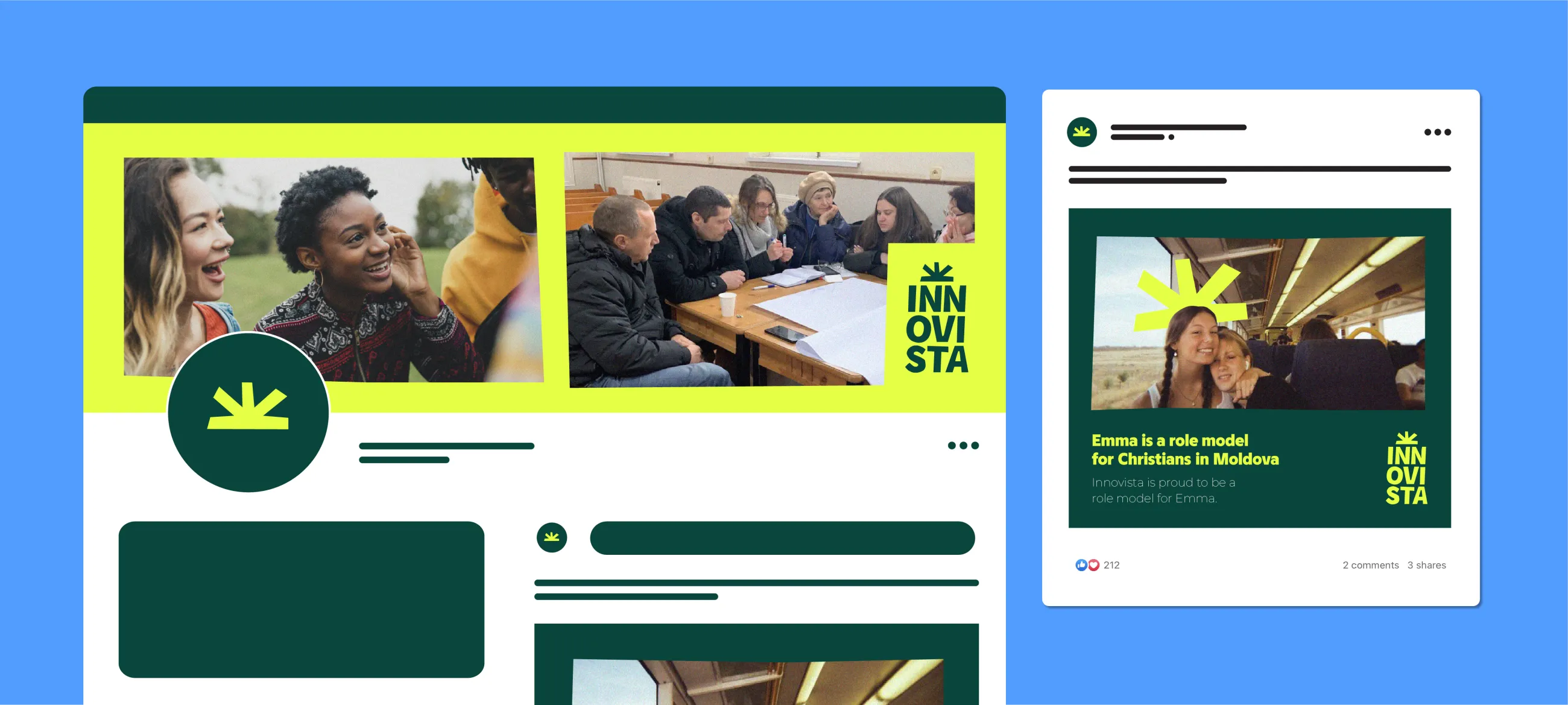
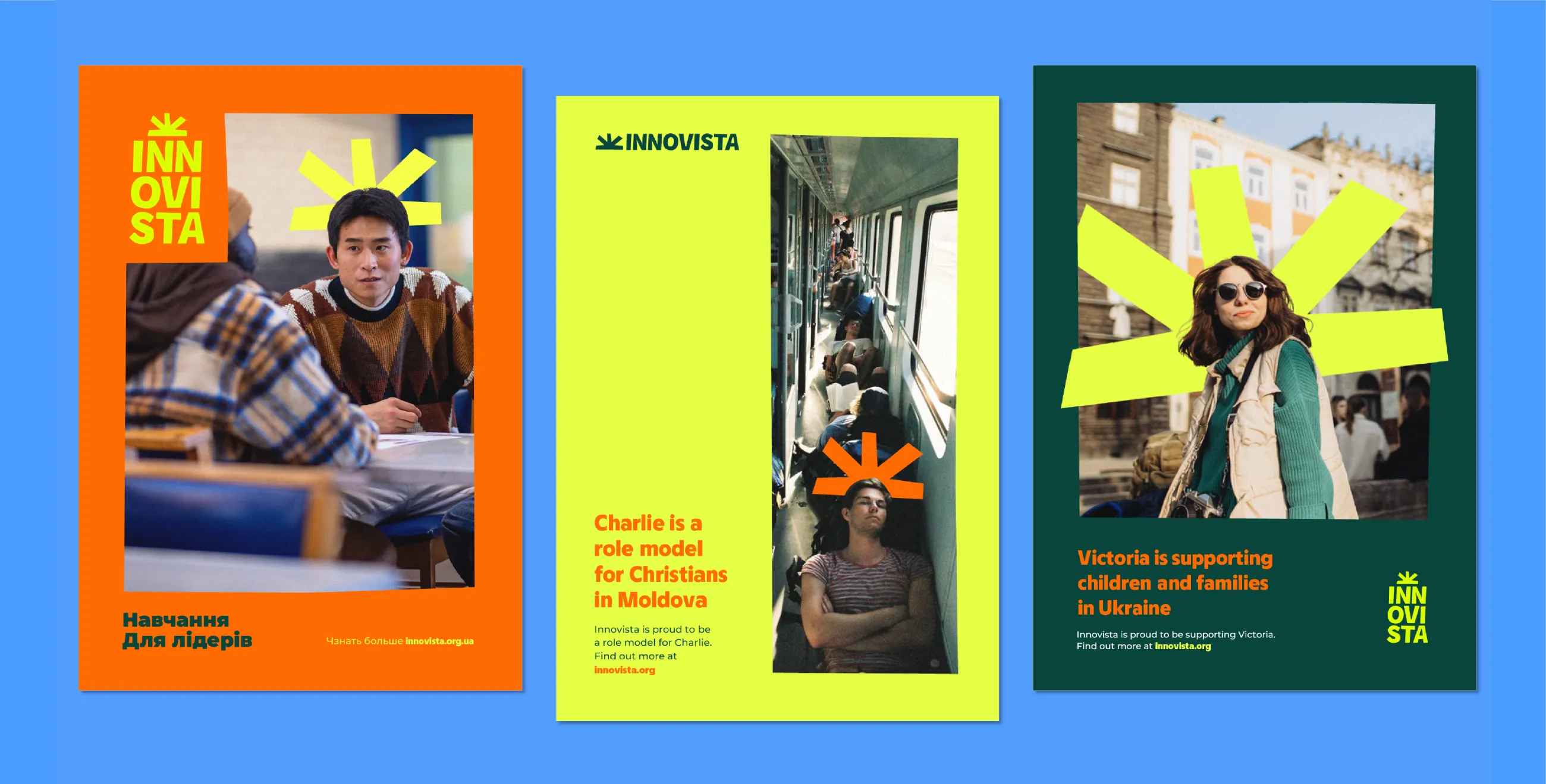
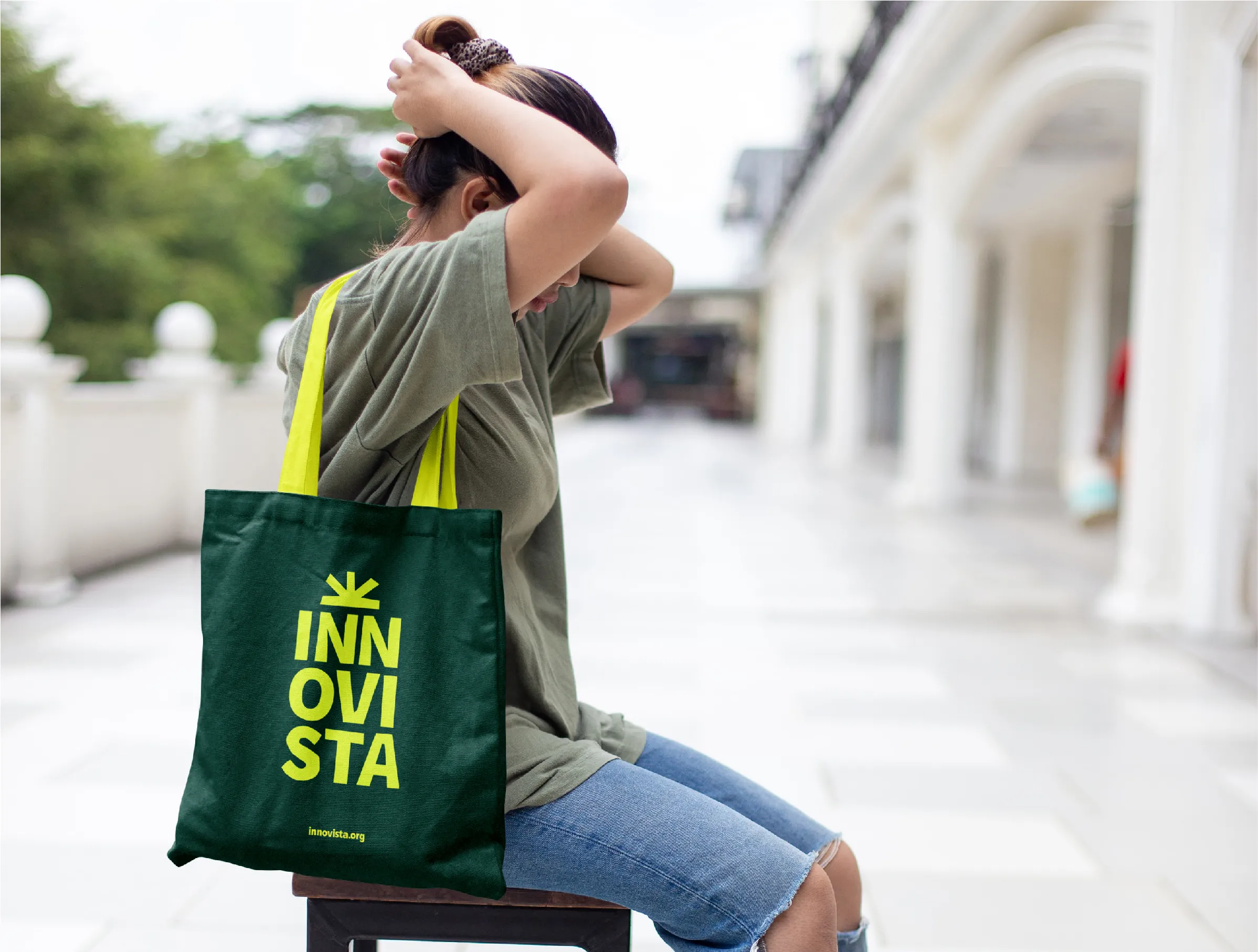
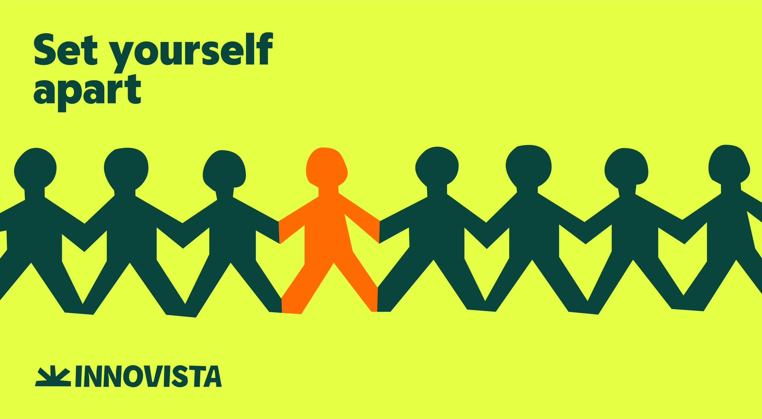
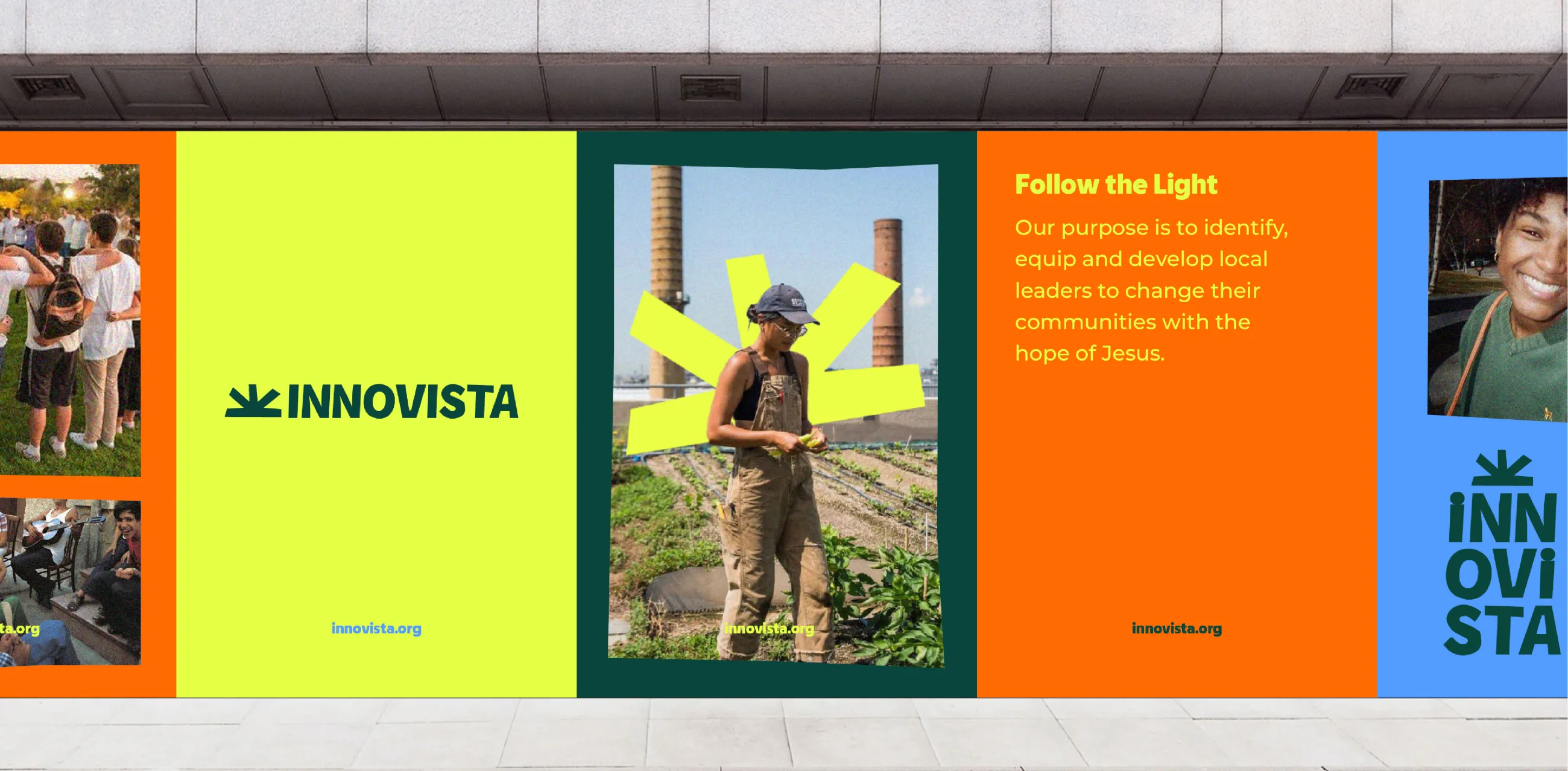
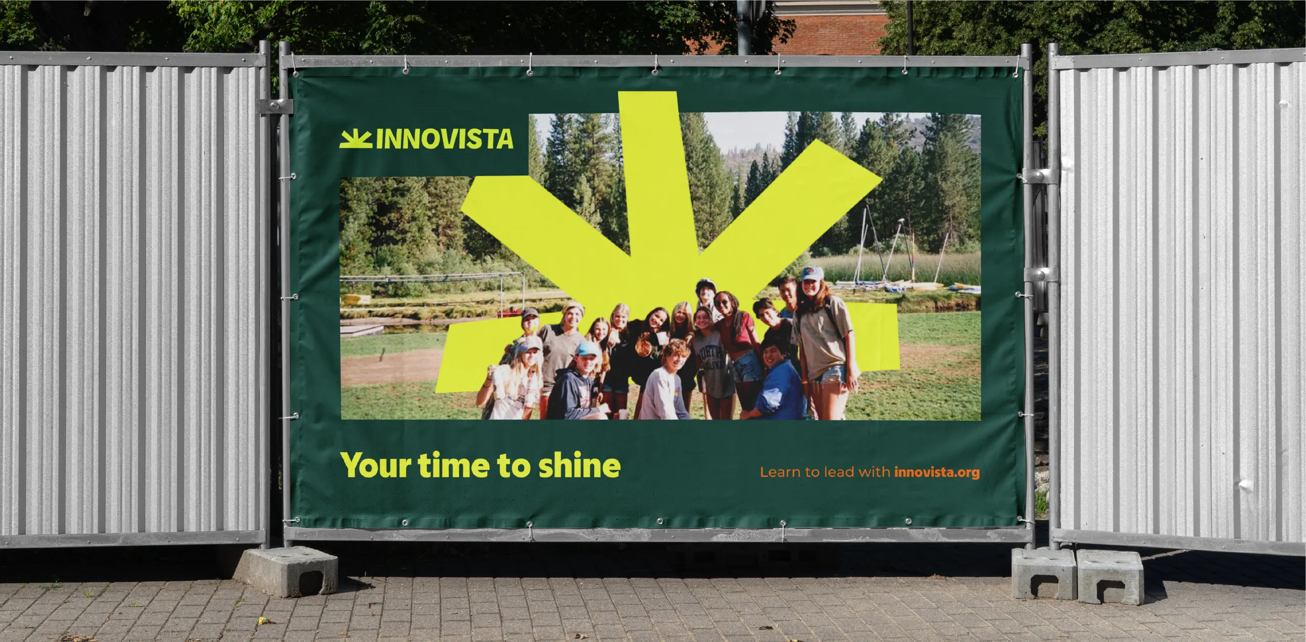
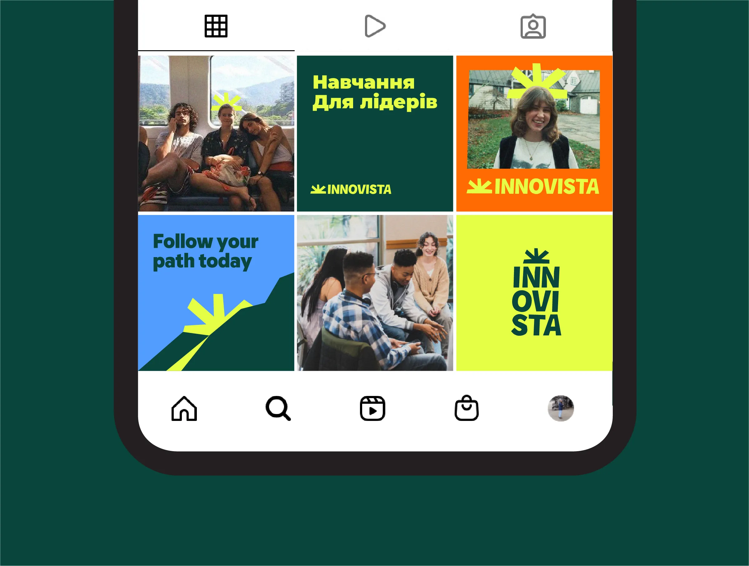
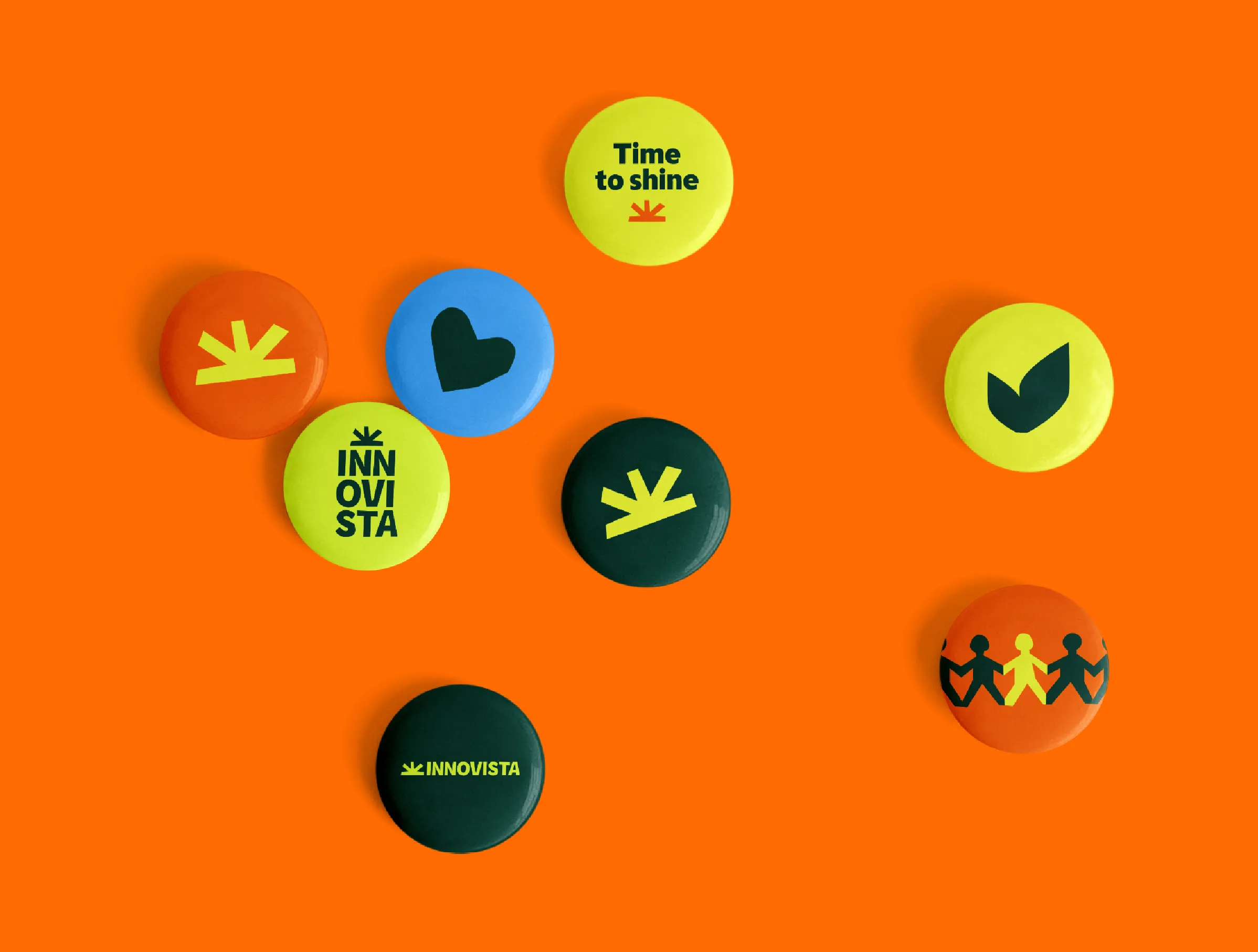
The new Innovista logo features a sunrise icon to communicate the hope, joy and positivity of the brand. It’s drawn in a bespoke, hand-crafted style to capture how the charity can also operate in gritty, challenging circumstances.
This cutout style is carried throughout the visual identity in icons and illustrations that help tell Innovista’s story. We also add a slight grain to the charity’s authentic photography for a grittier feel.
IE’s design team used the sunrise icon to bring Innovista’s leaders to the forefront of the brand’s identity. We combine the icon with photos of leaders – alone or in groups – to shine a light on their work and highlight their impact. If needed, Innovista can also use the icon to obscure people’s faces to protect their identity.
To make the visual identity flexible across many different uses we designed a ‘responsive' logo. Innovista can flip between the horizontal orientation and a stacked vertical logo, across different screen sizes and aspect ratios. The sunrise icon also works as a supergraphic.
The joyful quality of the brand comes through in its bold, bright colour palette. These colours were carefully chosen to avoid shades that might be problematic in certain cultures.
Image
Image
Video file
Support
Support
We crafted a set of brand guidelines to protect Innovista’s new visual identity.
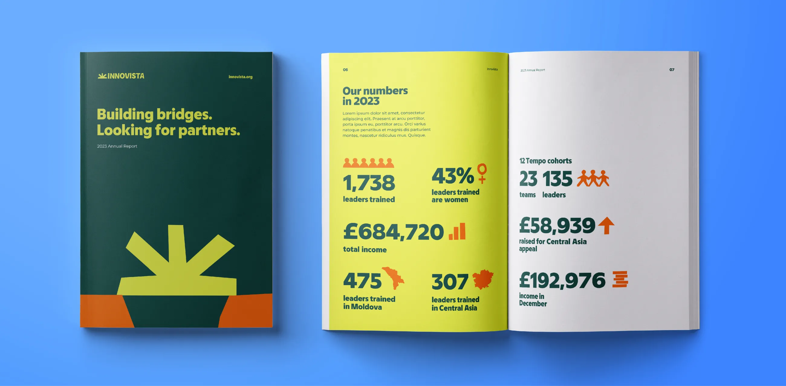
The guidelines support Innovista’s team – including a designer based in Ukraine – to maintain and present a consistent and engaging brand. They demonstrate how the visual identity can be applied to posters, reports, apparel and social media.
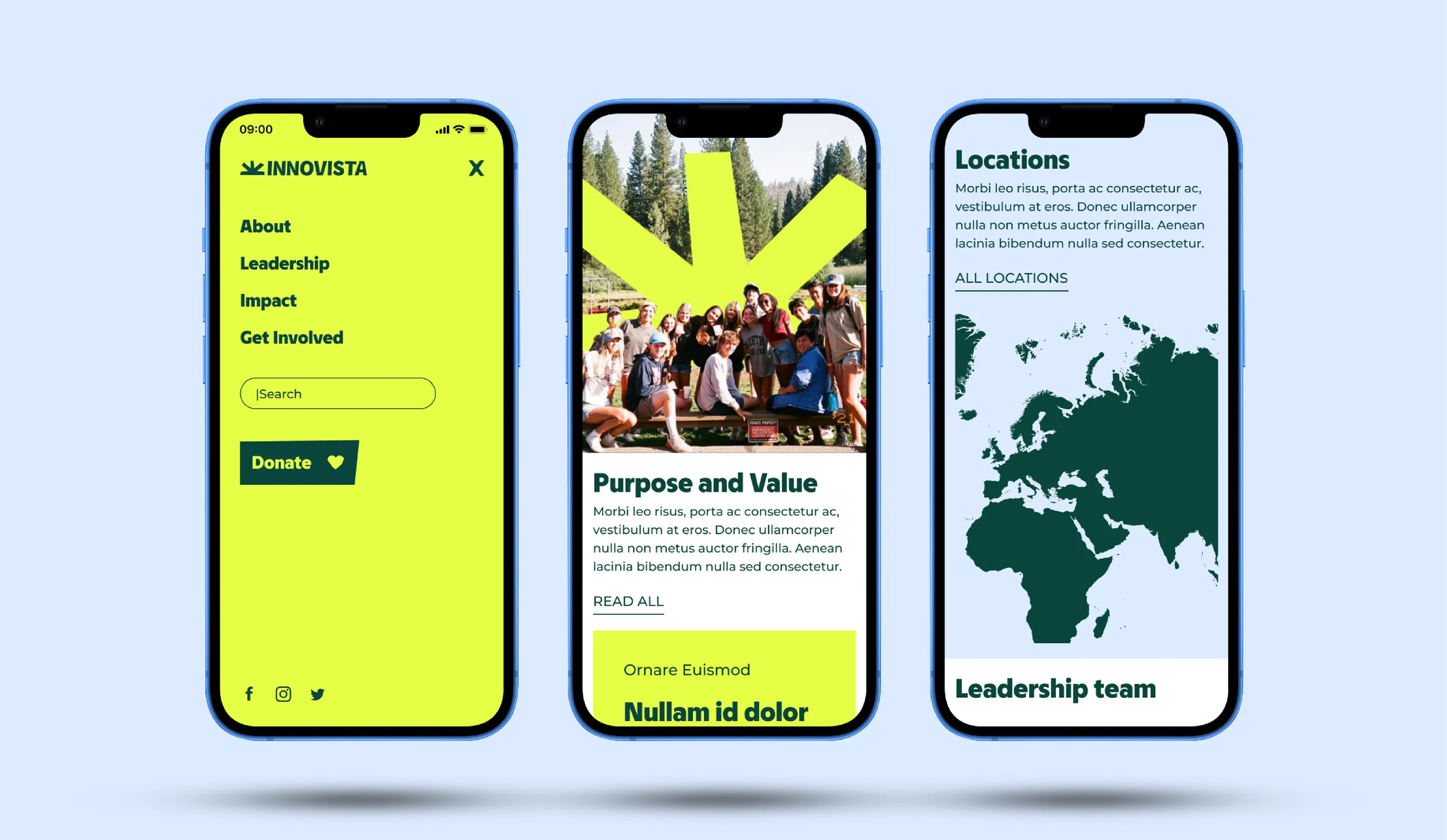
We also designed the user interface for Innovista’s new website. Then we handed the InVision storyboards and final Sketch output files to the client’s web developer for implementation in WordPress, overseen by our team.
Image
Video file
Image
Image