Herts SU

Hertfordshire Students' Union – Herts SU – is an independent registered charity, representing all students at the university of Hertfordshire. They help students to make their time at uni memorable, drive the changes they want to see, and provide advice when they’re in need.
We were looking to move away from branding that had run its course. In consultation with a number of stakeholders, there was a real demand to make sure our new visual identity was simple but striking. Safe to say IE Brand hit this brief with our bold look and feel!
We’ve had an amazing reception to the new branding, from staff and students alike. Everyone has commented on how striking it is, how appropriate it is for a Students’ Union (many saying it’s what we’ve been missing) and the way in which it simplifies our complicated structure. To this day we're still obsessed with the end result and we couldn't recommend a brand agency more. Thank you ever so much!
Samantha Gibson, Acting Marketing Manager, Herts SU
Before we landed
Hertfordshire Students' Union knew their brand was rather dated and tired. It wasn’t communicating the personality and values of the Union, the depth of their expertise, or reflecting their desire to impact the lives of their student membership.
The challenge we were set
IE Brand came on board to help reposition Herts SU in the minds and hearts of their audiences. They needed a bold new visual identity that would stand out on the University of Hertfordshire’s campus and reflect its rapidly changing, diverse student population. They needed to more clearly communicate what they can do for the students, and why they should get involved.
The difference we made
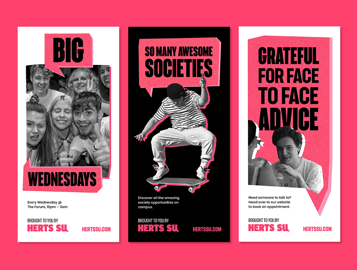
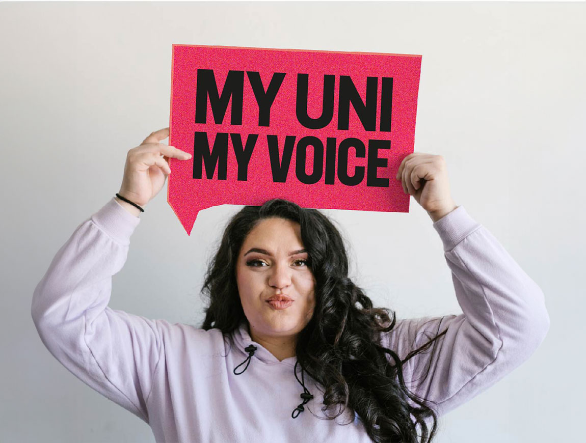
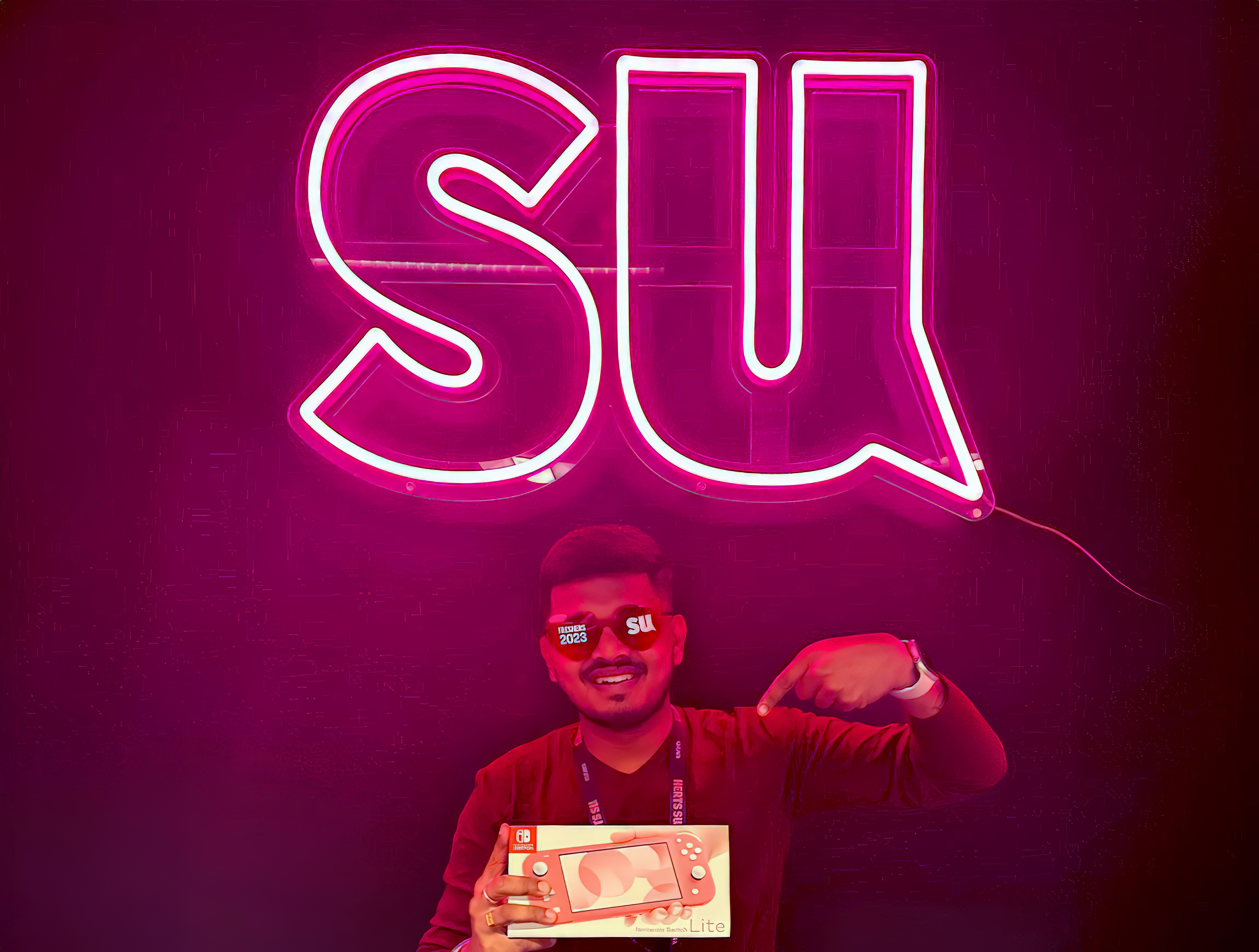
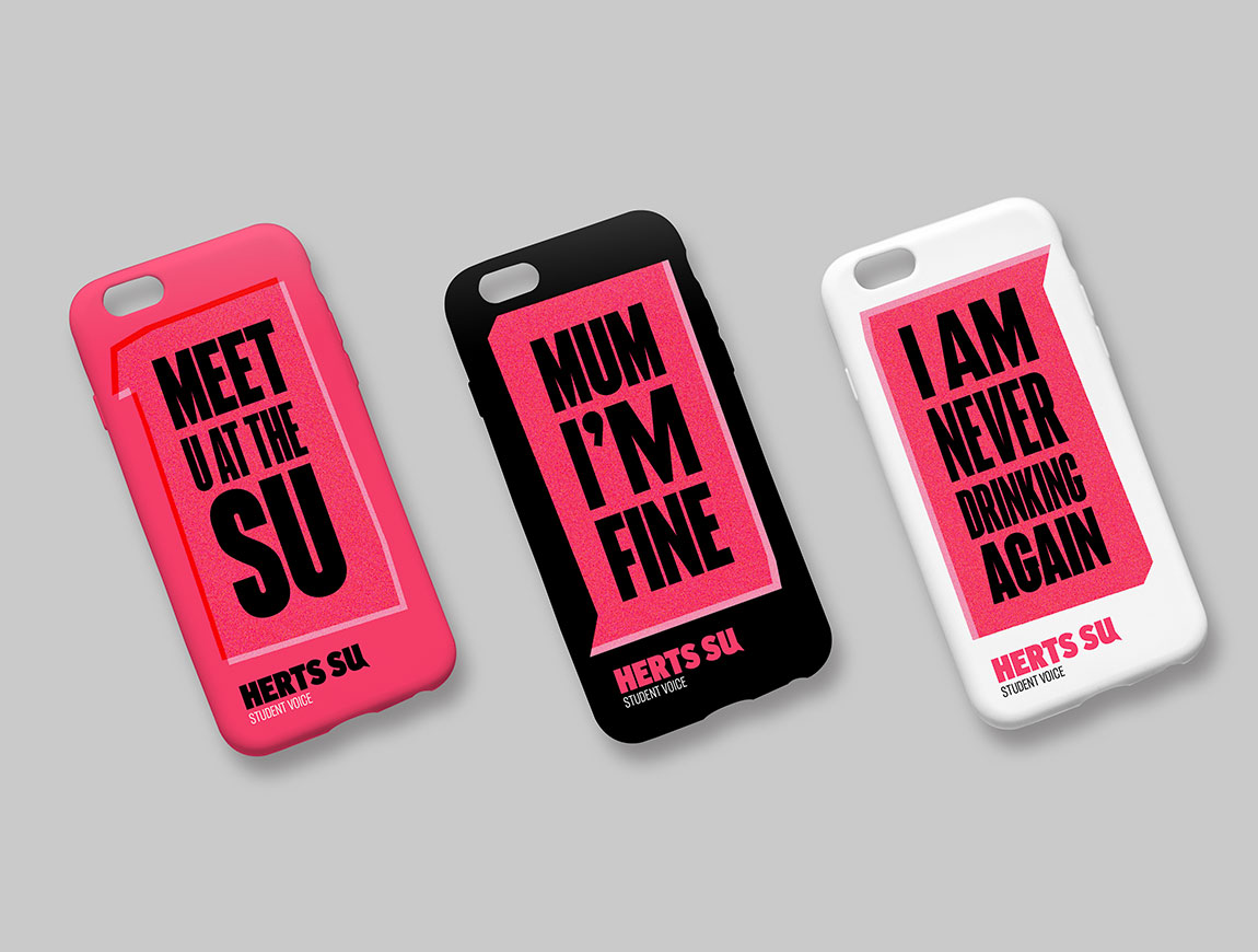
Following a series of stakeholder workshops, IE’s design team set to work on the new VI. We created a striking new visual identity based around a speech mark device, reminding students and the university that Herts SU's primary purpose is representation – to be and to amplify the voice of students. This motif appears on the U in the Herts SU logo and throughout the brand as a containment device for bold typography, giving an activist, campaigning, protest movement feel to the identity.
We used a strictly limited, vibrant colour palette of electric watermelon pink alongside black and white to make the SU’s communications stand out from the crowd on campus. The core palette is complemented by softer secondary colours of pink and coral.
We use photography in a rough, cut-out style, primarily in black and white. Colour photography and a broader palette are reserved for certain purposes, such as Pride events.
Work on the new brand began in June 2022, working to very tight timescales. IE Brand delivered the new visual identity and full brand guidelines in just 2 months. The new brand identity rolled out in the run up to Freshers' Week and proved a huge hit across campus.