IE Brand works with charity, health and education clients up and down the UK, as well as internationally. Sometimes we work for large charities and universities that are household names, and sometimes we help small health and social care providers, colleges, or charity startups with big ambitions. If you’re a values-driven organisation with a challenge, then we’d love to add you to our list of clients!
- Home
- Brand Clients
Brand Clients


Born from the merger of two Bowel Research charities – Bowel Disease Research Foundation and Bowel & Cancer Research – Bowel Research UK is committed to radically changing the outlook for people living with bowel disease, through vital patient-centred research.
IE worked with the charity throughout the process of stakeholder research, renaming and rebranding. The result is a bigger, stronger, united brand identity dedicated to ending bowel cancer and bowel disease. A new WordPress site provides a home for funding applications, donations, and information on bowel cancer and bowel disease.
Read the full renaming and rebranding case study for merged charity Bowel Research UK.
CloseIE Brand has helped us to navigate the landscape of rebranding our charity. What has impressed me most is the continuity of care. From the bidding process to the reality of working with IE, there is absolutely no difference – IE make us feel like we are their top priority client. They are clearly very knowledgeable and skilful, and this comes through at every stage. They are undoubtedly bringing out the best in our charity and involving us at every step. They have helped us to negotiate some challenging internal conversations, providing support and options at every turn.
Kathryn Pretzel-Shiels
Board Member & Chair of Fundraising & Communications Committee
 Get in touch


A new brand for the Bank Workers Charity, built around their people and their community. The charity has been supporting the banking community since 1883. Each year they help thousands of current and former bank employees and their families, providing information, advice, expert support services and in some cases financial assistance.
The new brand uses people's stories and experiences to encourage others to ask for help and start a conversation.
The rich visual identity includes various elements that can be combined in myriad ways. Stamps, symbols, commissioned illustrations and framed photography bring comms to life, with a bold and bright colour palette.
Close
 Get in touch


L’Arche is building a world where people with and without intellectual disabilities are friends and equals. Their diverse global community has been living together, working together, and learning from one another, for nearly sixty years.
The charity needed a rebrand and a new website, and IE was only too happy to help.
Visit larche.org
CloseWorking across multiple languages, cultures and contexts, IE approached our challenges with sensitivity, skill, and insight: to help us re-articulate our core proposition.
Heather Coogan
The resulting messaging and visual identity have helped to increase unity internationally and will allow us to harness the combined power of our global brand for the first time.
They have also been extremely supportive, helpful and easy to work with!
Director of Public Engagement
 Get in touch


Innovista supports Christian leaders where they’re needed most, equipping leaders to build a better world. Every year, they train and mentor around 1,500 leaders in Britain, Ireland, Moldova, Ukraine, Central Asia and beyond. They help leaders to transform people and communities through churches, ministries and enterprises.
IE Brand helped Innovista to describe what they do clearly and confidently, and created a colourful and inspiring visual identity that shines a light on the amazing work of their leaders. We also designed the charity's new website.
Read the full Innovista rebrand case study.
CloseIE helped Innovista International with a rebrand and a new website design. They delivered a fresh and contemporary look that has greatly enhanced the visual appearance of our organisation. IE also provided excellent advice on how to communicate with our supporters in a more pointed, concise and engaging manner. We are very pleased with the outcome as it has helped us to more effectively demonstrate how we support Christian leaders where they’re needed most.
Simon Wenham
Communications Manager, Innovista
 Get in touch


Prior to investing a significant sum in a national campaign to raise brand awareness in the UK and Ireland, Christian Aid commissioned IE to undertake a brand audit and a top-level response to the proposed campaign strategy.
The work was effectively a high level 'sense check' in order to ensure that this household name, £100m+ charity was as well prepared as possible to optimise the impact of an omni channel, above and below the line marketing campaign to drive up awareness of the critically important work of the charity.
CloseIE delivered a succinct and astute evaluation of the challenges facing our brand. They clearly have a passion for their work, combined with a really helpful mix of charity and wider market knowledge.
Claire Aston
Head of Strategic Communications, Christian Aid
 Get in touch


Resuscitation Council UK is working towards a day when everyone in society has the skills they need to save a life.
IE Digital rebranded the charity to become more public-facing, winning Bronze at the Transform Awards 2021 for "Best Visual Identity from Healthcare and Pharmaceuticals". We also built their user-friendly new Drupal 8 website, to provide an intuitive user experience for healthcare professionals and the public alike.
Explore how we rebranded Resuscitation Council UK.
CloseWorking in partnership with IE, we’ve been able to develop a new brand and website which really capture the ‘look and feel’ of who we want to be as an organisation. Visually, it looks great. The tone is welcoming and accessible, while maintaining the understated authority and clinical credibility which remain key to our reputation.
James Cant
An aged and clunky website has been replaced by one which is intuitive, user-friendly and accessible. IE has played a key role in driving our digital transformation, increasing our ability to engage and influence expert and public audiences alike.
Chief Executive
 Get in touch


Christian Unions are student-led mission teams that operate at the heart of university and college campuses – students reaching students with the good news of Jesus. UCCF: The Christian Unions supports student leaders in this work.
IE Brand simplified UCCF’s brand architecture and created a flexible visual identity with a dynamic new logo. With the Coronavirus pandemic affecting how new students experienced university, we also developed an integrated, digital-first campaign to UCCF reach out to their audiences in new ways, including UCCF's first social media advertising across Facebook and TikTok. And we supported the in-house development of a new website, creating the overall user experience and user interface design for the site.
Read the full case study on how we rebranded UCCF and created the campaign.
Close
 Get in touch


We worked with Herefordshire Council on a community engagement campaign. The combined effects of the coronavirus (COVID-19) pandemic and severe flooding in the Herefordshire region, have had a huge impact on the community. But it also demonstrated what's possible when everyone pulls together – from the council and the emergency services, to the general public and local businesses. Talk Community builds on this effect, to create solidarity and a shared purpose for the people of Herefordshire.
IE Brand created the Talk Community brand identity, built a new website, produced a promotional video starring 'Escape to the Country' presenter Jules Hudson, and rolled out the campaign across social media and local advertising.
Close
 Get in touch


Langley Trust is a Christian charity that helps people with convictions to transform their lives. They believe everyone deserves another chance.
Across the UK, they support prison-leavers, promoting rehabilitation and reducing the risks of re-offending.
They tasked IE Brand with supporting them through a rename and rebrand project, to reflect the exceptional organisation they are. The rebrand and a new WordPress website launched in September 2023 alongside Langley's 65th anniversary celebrations.
CloseIE have been a creative joy to work with. From start to end they were clear about their processes and methodology, we had fun working together despite pretty much all of this being online. We are delighted at the results, a new brand, brand guidelines, messaging matrix and a website. Everything came in on time and to budget. Despite a significant staff change at our end and Langley being a dispersed organisation, IE worked with our project leaders professionally, calmly and with the creative energy we had hoped for. Thanks IE it’s been a blast!
Rev Andy Rider
Director of Chaplaincy Services
 Get in touch


Young Lives vs Cancer (formerly CLIC Sargent) is the UK’s leading cancer charity for children, young people and their families. The charity commissioned IE to create an innovative mobile online community to help 16-24 year olds living with cancer.
IE helped Young Lives vs Cancer to interpret its brand for this young adult audience and brought it to life through a community based around hashtags, trending topics and Q&A. It brings together young people going through a difficult time in their lives and gives them access to information, peer support and expert advice, all moderated by the charity's professionals.
The app took a mobile-first approach, acknowledging the digitally-savvy user profile and putting support for young people right where they need it in the palm of their hands. A mobile app was later developed for both iOS and Android devices.
CloseWe came to IE with a complex brief for our online community. IE focused on the essential principles, actualising this into an intuitive website that will help Young Lives vs Cancer build a vibrant space for 16 to 24-year-olds, who have, or have had cancer.
Helen Thomas-Fox
Senior Digital Manager, Young Lives vs Cancer
 Get in touch


The Royal Air Forces Association (RAFA), is a membership organisation and charity that provides practical assistance, expert advice and emotional support to the RAF Family.
RAFA's support services are offered to all serving and ex-serving personnel and their dependents. They include welfare support, a befriender service, Wings Break hotels and sheltered housing.
IE Brand is RAFA's creative partner for their extensive campaign plan, helping to meet the charity's strategic objectives. One of our first projects was to create a new brand for RAFA Kidz, a not-for-profit nursery business that delivers fun, affordable and nurturing early years childcare in a welcoming environment, on RAF stations.
We also created the "Finding It Tough?" campaign to launch a new series of one-day mental wellbeing courses. We scripted the narration for a series of campaign films based on four different user personas. The campaign materials including postcard mailings and magazine and social media ads have a strong visual signature based on authentic handwriting.
CloseIt’s been a pleasure working with IE on branding the RAFA Kidz project. They understood our brief straight away and developed a fresh, exciting look and feel that maintains the core elements of the RAF Association brand while creating a fun, vibrant sub-brand that would appeal to parents and children. IE offered us useful advice and insight on how we use the brand to produce a wide variety of deliverables. Working to tight timescales, the team at IE really put us at ease throughout the project, as we knew the design work was in safe hands. The launch of the first RAFA Kidz nursery was a great success, and was really well received by parents, employees and RAF personnel.
Emily Rooke
Brand Marketing Manager, Royal Air Forces Association
 Get in touch


IE Brand created a new brand and visual identity for CharityJob, including a new logo and strapline. To coincide with a new improved recruiter website (developed by the in-house team) in October 2017, the visual identity also rolled out across social media, email and offline branding.
It was important to bring CharityJob's values to the fore, and remind recruiters and candidates that they are more than just a job board. They are a team of passionate specialists with deep sector expertise, enabling charities to thrive in an ever more challenging climate, and helping candidates to make the most of their talents.
To showcase CharityJob’s 17.5 year history of helping over 20,000 charities and not-for-profits to find their best people, we placed a greater emphasis on real life success stories.
Explore the CharityJob rebrand case study.
CloseIE Brand have gone above and beyond to transform our brand. We loved the fact that they challenged our team and got us to get out of our comfort zone for this project. It’s been an incredible journey and this marks a new chapter for CharityJob. From the core messages to visual identity, they truly captured who we are as a team.
Jade Phillips
Brand & Communications Lead, CharityJob
 Get in touch


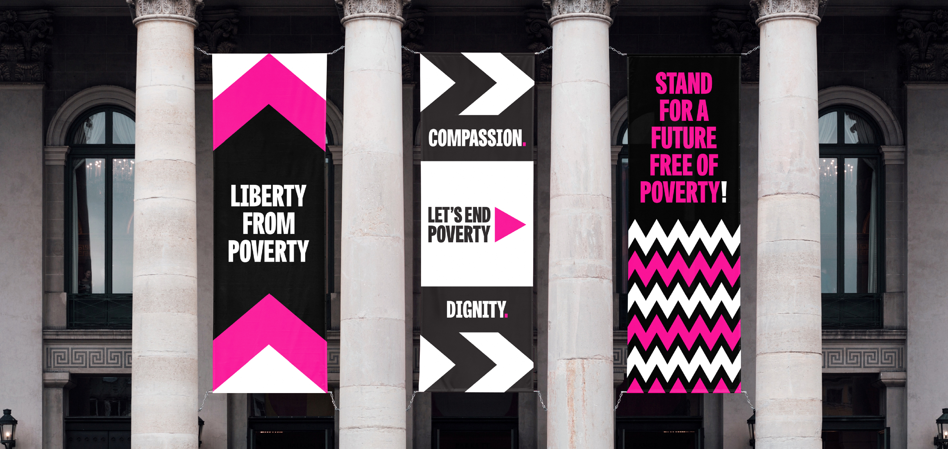
Let’s End Poverty is a diverse, growing movement of people who are united behind a vision for a UK where poverty can’t keep anyone down. Anyone can be part of the movement, whether you’re an individual, a group, a faith community, a business or an organisation.
IE created the colourful campaign brand and Let's End Poverty website.
Close
 Get in touch


University of Reading Careers supports its students in achieving their potential and prepares them for the competitive employment market. Struggling with low levels of visibility and engagement, Reading needed to cut through the ‘noise’ of wider university messaging.
IE Brand began with audience listening through workshops with student, staff and Student's Union representatives, which revealed that Reading students needed a combination of gentle coaxing and a firm kick-up-the-backside. This informed a Jekyll and Hyde approach to the new brand. IE Brand created a set of beautiful, distinctive visual assets carrying powerful messages to support a host of campaigns and events throughout the academic year.
In the two years since the rebrand, the number of individual students taking advantage of appointments with the careers service have increased by more than 30%.
Read more about Reading's careers brand or explore IE's other rebranding work with university careers services.
CloseIE Brand's work genuinely surprised and delighted us. Challenging, pithy tag lines and intriguing, quirky imagery combine to deliver precisely the mix of behaviour changing messages that Reading Careers needed to drive up visibility and engagement. What's more, when we did a show and tell to our Vice Chancellor he ‘loved’ it!
Lorna Froud
Director of Careers and Employability, University of Reading
 Get in touch

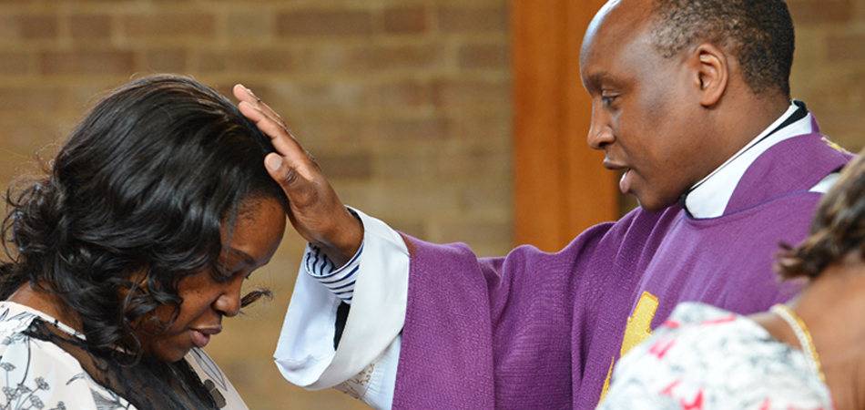
Clergy Support Trust helps Anglican clergy and their families in times of need. They offer grants and wellbeing support to members of the clergy (including ordinands and retired clergy), as well as their dependants and partners – whether married, separated or widowed.
Explore our award-winning rename and rebrand for Clergy Support Trust (formerly Sons & Friends of the Clergy).
CloseIE Brand came on board at a time of considerable change for our 364-year old charity, which supports Anglican clergy and their families. Our old brand was part of our history, but was no longer relevant or accessible to today’s clergy. IE Brand helped with stakeholder engagement and in establishing the case for change through beneficiary research. We’re delighted with our new name and visual identity, which will enable us to reach more clergy families in need. We were impressed with the IE team, and have also now entrusted them with redesigning our website.
Jeremy Moodey
Chief Executive, Clergy Support Trust
 Get in touch

IE Brand created the dynamic, colourful new brand and website for the UCD Innovation Academy. Read the website case study.
IE Brand had also previously renamed and rebranded The Career Development Centre at University College Dublin, relaunching it as UCD Careers Network with a new website. UCD is the 12th university careers service to be rebranded by IE – and our first outside of the UK. Read more about UCD's Careers Network brand or explore IE's other rebranding work with university careers services.
CloseHaving done all the strategic ground work in house to transform the Careers Network, we turned to IE to bring it all to life through our brand. They did a fantastic job of engaging and exciting the whole team and reminding us how great we are at what we do! They understood us, and exposed the value we deliver to our key audiences in an engaging and accessible way.
David Foster
The new website guides students through the actions they can take and the help they need. We love the vibrant new visual identity, and the brand guidelines, templates and collateral have made the roll-out easy.
Director, UCD Careers Network
 Get in touch
Want to learn more about our work? Call us on 0121 693 8700 or get in touch to tell us about your challenge.


